How to Customise Popcorn Time with Themes and Icons
Popcorn Time’s familiar catalogue layout is designed for quick browsing, but its appearance can feel repetitive after extended use. Depending on the fork and operating system, you may be able to adjust colours, typography, artwork, spacing, and navigation icons to create a cleaner viewing environment.
Interface customisation can be as simple as selecting a built-in dark theme or as advanced as replacing image assets inside the application folder. The available options vary considerably between desktop releases, Android builds, and unofficial community versions, so a theme that works on one fork may be ignored by another.
Before changing files, identify the exact Popcorn Time version installed on your device. Look for the version number in the settings screen or application information panel, then check whether the project supports themes through its own menu. This small step helps prevent incompatible files from affecting playback, subtitles, or library data.
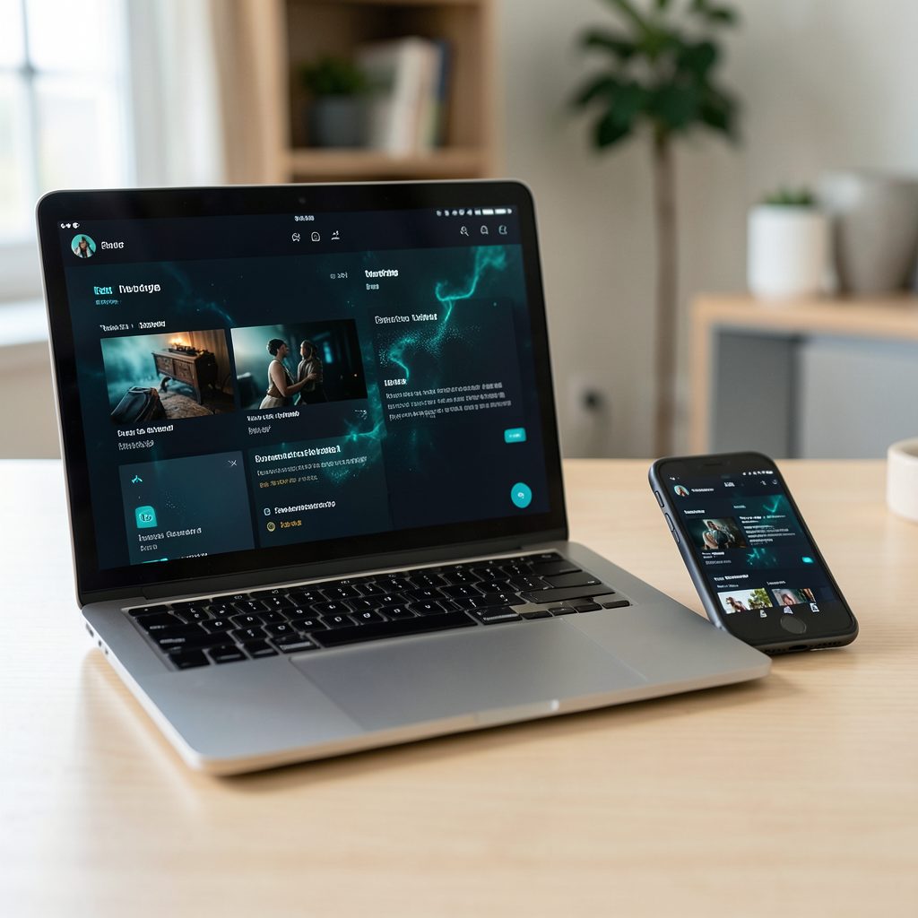
Australians often move between a laptop, television, phone, and streaming stick during the week, particularly in homes where different people have different viewing habits. A customised interface can make that transition more comfortable, but it should sit alongside sensible security practices, legal awareness, and a reliable backup of the original installation.
Check Your Fork Before Editing
Popcorn Time is not a single centrally maintained product. Several forks and builds use different frameworks, folder structures, and design systems. One may store its interface in HTML, CSS, and JavaScript resources, while another packages those files inside an archive that should not be edited directly.
Start by opening the settings or preferences area. Look for labels such as Appearance, Interface, Theme, Skin, or Advanced. A supported theme selector is the safest route because it normally checks whether the colour scheme and graphics match the installed release. If no appearance controls exist, consult the fork’s documentation rather than downloading a random replacement package.
On Windows, application resources may be stored in a program installation directory or in a user profile folder. macOS commonly places supporting files within the application bundle, while Linux builds can use a hidden configuration directory in the home folder. Android versions may restrict access to internal resources altogether. Copy the entire application folder or relevant configuration directory before making changes.
Version compatibility matters especially when a fork receives a redesign. A theme created for an older interface may reference buttons, menus, or icons that no longer exist. The result can be missing artwork, overlapping controls, blank screens, or an application that closes during startup. Keeping the original files makes recovery much easier.
Choose a Practical Colour Scheme
A theme changes the visual language of the app through background colours, panels, text, highlights, and state indicators. Dark themes are popular for evening viewing because they reduce the amount of bright light around the poster grid. A softer charcoal background is usually easier to read than absolute black, particularly on older LCD televisions.
Pay attention to contrast rather than choosing colours purely for style. Primary text should stand out clearly from the background, and secondary information such as runtime, rating, or release year should remain legible at a distance. Bright accent colours work well for selected buttons, but using the same intense colour everywhere can make the interface look crowded.
A useful custom palette might use a charcoal background, warm grey panels, white primary text, muted grey metadata, and one amber or blue accent. Avoid changing only the background while leaving text colours untouched, since a darkened panel can make existing black labels almost invisible. Check the catalogue, details page, search field, settings menu, and playback controls before keeping a new scheme.
Screen conditions matter in Australian homes. A theme that looks comfortable in a dim Melbourne apartment may appear washed out in a bright Queensland living room during the afternoon. Test the design at different brightness levels and viewing distances, especially if the device is connected to a television through Chromecast or another media receiver.
Replace Icons Without Breaking Navigation
Icons are usually stored as SVG, PNG, JPG, or font-based assets. SVG files are useful for interface symbols because they scale cleanly across a laptop display and a large television. PNG files can be suitable for poster-style artwork, although transparent backgrounds and consistent dimensions are important.
Before replacing an icon, inspect its original dimensions and filename. A home symbol, search symbol, settings cog, download marker, and playback control may be loaded by exact path. Renaming a replacement file or changing its extension can stop the interface from finding it. Preserve the original naming convention unless the fork’s documentation says otherwise.
Design a complete set rather than replacing one or two symbols with unrelated artwork. Consistent line weight, corner shape, and visual density make the interface easier to scan. A thin outlined search icon beside thick filled navigation symbols can look untidy and may be difficult to distinguish from a television viewing distance.
Use simple, recognisable graphics for essential actions. The play, pause, back, close, volume, subtitle, and cast icons should remain immediately understandable. Avoid decorative symbols that resemble controls but perform a different action. After each change, open a film page, start a video, enable subtitles, and test the navigation controls with both a mouse and a remote where supported.
Build and Apply a Custom Theme Safely
Advanced users may be able to edit a stylesheet or theme configuration. Common properties include background colours, font sizes, border radii, spacing, card widths, hover states, and focus outlines. Change one group of properties at a time and restart the application after saving, since some builds load theme resources only during startup.
Keep a plain-text record of each change. If the app supports custom CSS, use clear comments and avoid altering functional selectors unless necessary. A small visual change, such as increasing line height or enlarging the selected-menu indicator, can improve accessibility without modifying the application’s playback logic.
Image formats and file sizes also affect performance. Oversized poster replacements may slow the interface on an older laptop or consume unnecessary storage on an Android device. Compress decorative graphics, use transparent backgrounds where appropriate, and keep filenames free from unusual characters that may cause problems across operating systems.
Download themes only from sources that explain which fork and version they support. Treat executable installers, modified application packages, and files requesting broad system permissions with caution. A theme should not need access to unrelated documents, browser data, or account credentials. Scan downloaded files with current security software and retain a clean copy of the original installation.
Personalise the Experience Across Devices
A desktop theme may not translate well to a phone or television. Small screens benefit from larger touch targets, fewer simultaneous controls, and stronger contrast. Television interfaces need generous spacing, clear focus states, and controls that remain visible from several metres away. A layout built for a 27-inch monitor can feel cramped when mirrored to a lounge-room screen.
If you use AirPlay, Chromecast, or another playback method, remember that the interface and the video output may be handled by separate devices. Changing the desktop theme normally affects browsing on the computer, not the television’s own playback controls. Test the full path from searching for a title to selecting subtitles and controlling playback.
A customised interface can also help distinguish Popcorn Time from other services in a crowded home media setup. If your household switches between local media, subscription platforms, and free legal services, use a restrained colour scheme and clear labels rather than imitating another brand. Those considering the broader value of different platforms can review this streaming comparison before deciding how much time to invest in personalisation.
Australian users should also consider how content access and copyright rules apply to the particular material they stream. The Copyright Act 1968 remains relevant to unauthorised distribution and access, and Australian rights holders can seek site-blocking measures through the courts. A VPN may improve privacy on public Wi-Fi, but it does not make infringing activity lawful, and its terms, speed, and logging policy should be checked carefully.
Keep a backup of your working theme and icon files in a separate folder. If a fork updates automatically, the new release may overwrite custom resources. Save the version number, installation date, and any notes about edited files so that you can restore the look quickly or recreate it after an upgrade.
Make changes gradually, test every major screen, and remove anything that reduces readability or stability. A successful Popcorn Time interface theme should make browsing calmer and navigation clearer without interfering with updates, playback, subtitles, casting, or device security.
Before using a custom design regularly, export or copy the original configuration, verify that your icons are from a trustworthy source, and confirm that the content you access complies with Australian law. Then apply the theme in small steps and keep a clean fallback available whenever the application changes.